Friday, 30 March 2012
Wednesday, 28 March 2012
1. In what ways does your media product use, develop or challenge forms and conventions of real media products? (i.e. of music magazines)
1. In what ways does your media product use, develop or challenge forms and conventions of real media products? (i.e. of music magazines)
The genre for my magazine is rock, so for inspiration I felt other rock based magazines would be appropriate. A cover is what draws in your audience so I really focused on having a cover with impact and style. I ended up choosing a personal favourite that I have a subscription to, Kerrang. Their main 3 colour scheme is black,yellow, white and red which breaks the mould of the 3 colour scheme, so in response to this I also tried to break the mould by using using two colours. Black and white. Kerrang inspired me when I was designing my con-tense. Using a system of page numbers then a sentence that sums up the top story on that page I replicated what Kerrang achieve every week. This ensures the reader can scan through the con-tense and then they can prioritise what pages are most important to them. This also makes the reader read more because you are only giving away the top story. There could be much more to read. I used white lines to brand my magazine just like kerrang used distressed font and a overall messy layout with splats and boxes. For my DPS I was inspired by a kerrang DPS on the band blink 182 that I thought had a very effective layout.
The genre for my magazine is rock, so for inspiration I felt other rock based magazines would be appropriate. A cover is what draws in your audience so I really focused on having a cover with impact and style. I ended up choosing a personal favourite that I have a subscription to, Kerrang. Their main 3 colour scheme is black,yellow, white and red which breaks the mould of the 3 colour scheme, so in response to this I also tried to break the mould by using using two colours. Black and white. Kerrang inspired me when I was designing my con-tense. Using a system of page numbers then a sentence that sums up the top story on that page I replicated what Kerrang achieve every week. This ensures the reader can scan through the con-tense and then they can prioritise what pages are most important to them. This also makes the reader read more because you are only giving away the top story. There could be much more to read. I used white lines to brand my magazine just like kerrang used distressed font and a overall messy layout with splats and boxes. For my DPS I was inspired by a kerrang DPS on the band blink 182 that I thought had a very effective layout.
Wednesday, 14 March 2012
Evaluation Questions
2. How does your media product represent particular social groups ?


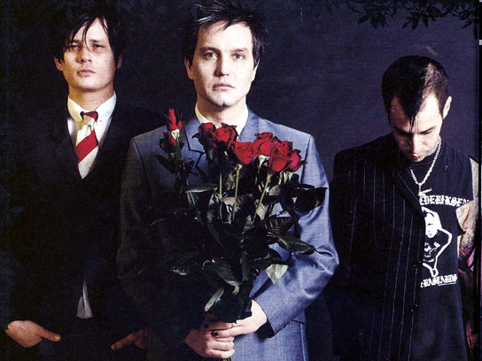
When deciding how i was going to dress and portray myself to the reader I took influence from many artists, but one in particular being Tom Delonge. Black jeans, leather jacket (he is not wearing one here but he is well known for it) and I made especially sure i wore cloths made by his clothing company Macbeth. I studied how he acted on stage and tried to emulate this. Wide stances, small bursts of action and sweeping stage presence are all typical of him. I tried to differ myself from him and add in a little bit of individuality. I play bass for one and he plays guitar. He adds a lot of humour into his performances whereas i tried to keep a serious tone over the whole shoot. He uses a lot of imagery in his music. A lot of masonic imagery is used in his music and his overall image and I tried to stray away from this, not being a freemason or having anything to promote. I tried to take certain aspects of his image and concentrate them down to just small things.
Monday, 12 March 2012


Wednesday, 7 March 2012

Wednesday, 22 February 2012
Monday, 6 February 2012

Friday, 3 February 2012

Thursday, 2 February 2012
Draft article
Genuine artists are hard to come by these days. Sure you have your new your Vacines, your Skrillex's and you Foster the Peoples but what today's music scene is currently lacking is a hard working artist who has bulit themselves up from scratch. Not an artist that had only been around for under a year or has a really convincing upsetting background, but someone with a good work ethic and a desire for success. Someone who had a vision and with the right people and alot of hard work made it a reality.Not many artists these days can honestly say they have acheived this. Most rely on lucky breaks or help from freinds who are "in the bussiness" but one band can honestly say that they saw what they wanted and made it what they live see and breath today.
This artist is No More Adventures.Its a typical January day with a wind sharper than a razor blade and the NMA boys have just walked into the premisis with a air of mischeife areound them. As the assumed front man of the group stummbles in he looks at me and shouts "ARE YOU THE BAKED BEAN WE ARE WITH?". At this point i realise this is not the frontman but the drummer Jack Mugglestone. After him walks Tom "Bigak" Ak, who takes the back seat in proceedings, laughing at the bumbleing actions of his bandmate. Lastly a sheepish figure stands at the door obseriving his flock like a shepheard. In the door frame stands Jack Olund. The vision.The messege of the band. He looks aprovingly at his bandmates and says "You need to calm down!". But down to bussiness.
They are an odd bunch are NMA but you can't put them down for what they have achieved. 1 record deal,1 best-selling album and a single currently number one in the NME chart. Not bad for 3 lads from a small town called Croft in the East Midlands.Just finishing up a headling tour of the UK and putting final touches on a brand new ep these are deffinetly busy boys but they have kindly taken time to sit down and ansewr a few questions that everyone has been asking.
ILL:So guys just finishing up a UK tour, how does that feel?
Jack:Tiring,but it has been a blast. I mean the first few dates were a bit shakey but thats just adapting to a larger stage really.
Muggy:I don't need to adapt, I'm like a geeko i can adapt to any enviroment.
Ak: Shut up
ILL: How have your hardcore fans reacted to your sudden exposure?
Muggy:A girl came up to me and said can you sign my basin and she has a full on wash basin with my face on it. That's my answer.
Jack:Yeah, i guess some fans arnt happy about it. I think they enjoy the smaller scale shows and so do i really. I mean don't get me wrong i love the sucsess but small shows are so much more intense and you can conect with the fans.
Ak: Reynold wasn't too impressed.
Jack: Oh Yeah, we have this one hardcore fan called Reynold he has been with us since the beginning and the day we signed our record deal we received a envelope full of unspecified liquid.We got rid of that pretty fast. He has come around now but at the time....
ILL:Reynold? I think he maywell be the charecter we have been seeing at NMA shows. No shirt.Lots of fist pumping?
Ak:Yeah, He is too hardcore he needs to calm down. I once caught him going through my bag taking my toiletries.
Jack: Nah he is harmless. When he is sober anyway. He has been with us back since we were called Tetris Effect, i remember him telling my that one day Familiar Face would be huge. I guess i should listen to him more maybe we will be playing wembely soon.
Muggy: When he is drunk ha ive seen apes that are more sophisticated. No word of a lie i saw him once take on a whole wall of death on his own. He is a brute force.
ILL: Jack,can you give us an insight into how you take a song from an idea in your head to the final product that we all hear?
Jack: Well, usally the enitial idea will be really stupid. I will be like driving and i will have to stop and record the idea on my phone.It will be something really basic like a drum beat or a guitar riff but as soon as i can i get it over to Ak. From there on it is really me and ak spitballing ideas around my idea until we have molded it into something playable.
Ak: Then at practice we have a chance to play it as a band and really get a feel for the song. This is where the real magic happens.
Muggy: I just kinda turn up and do as you say.
Test shots

This is the front man and a possible front cover shot.

Monday, 30 January 2012
Class Evaluation
Things that I picked up on from last weeks Q&A session.
1.I Need to be broader in my influences.
2.No ones knows who Tom Delonge is.
3.How am I going to fuse many genres.
4.Wide range of artisits how can i incoperate them all.
1.I Need to be broader in my influences.
2.No ones knows who Tom Delonge is.
3.How am I going to fuse many genres.
4.Wide range of artisits how can i incoperate them all.
Sunday, 22 January 2012

This is a contents page for Kerrang! It follows the basic colour scheme kerrang always follow, yellow,red black. Yet again just like the music they talk about and the front cover it is fairly hectic and is packed full of information. There is a highlighted article in the left corner then the rest of noteworthy articles are numerical listed. Next to them is a full contents. In comparison to a front cover this only has a maxminum of 5 layers and everything is fairly organised. The contents is arranged in to sections such as Gigs,Features and News this gives the page some structure compared to the rest of the magazine because although they want to give of a crazy vibe they still don't want readers to be lost and not know what to read. The things in yellow are the most important and the things in black are less important. The paragraph at the top of the page sums up the whole issue of the magazine.

This is a contents page for Rock Sound. Similar to Kerrang! in that they try to give of a crazy or metal image that also replicates the music they talk about. But this does differ from Kerrang in quiet a few ways. Firstly this is definitely not as packed as a Kerrang! contents page. The main focus of the whole page is the background picture, the subject is staring straight into the camera into the readers eyes giving them a connection. A small contents is displayed at the bottom of the page. This contents just summarises the best parts of the magazine leaving an element of surprise left to the reader. There are no sub headings just page numbers and there is a logo or mascot of sorts in the bottom left hand corner. In the top right hand corner there is a issue number,date and name, this establishes the time the magazine was published and what to expect inside. The font used is formal in the title of each paragraph then the description is in a scruffy handwriting-like font. This get across the main bulk of information without losing any style regarding the music and image.

This is a contents page for NME and the general feel of the whole magazine is a bit lighter and more "hipster" compared to Kerrang! and Rock Sound. There is still a feel of mayhem and even though NME is a more rounded magazine and the music may not be as heavy as in Kerrang or Rock Sound. The main focus is the picture bang smack in the middle of the page, a bigger font is used to show a bigger article and each page number is in red to make them stand out and make sure you do not forget the number for later reference. Unlike Kerrang or Rock Sound this has a index that lists al the bands featured in the magazine and one or multiple page number. This is because some people may buy this magazine because they just want to hear about maybe 3 or 4 individual and they can just look at the index.There are sections again for the whole magazine that divided up certain topics that the magazine has to offer. This magazine also offers a advert at the bottom of the page with contact details and a discount offer. They also claim they have the UK's number 1 gig guide.
Wednesday, 18 January 2012
My Bands Logo. Similar style to my magazine.
http://soundcloud.com/no-more-adventures Link to our stuff :)
Institutions
My ideal institution is the Bauer Media Group becuase they puplish many other music magazines such as Kerrang! ,Q, and Mojo. They are based in Hamburg, Germany and opperate in 15 different countries. Since 1875 they have been privately owned and is under manegment my the Bauer family.
Title ideas and colour schemes
Today i am working on trying to find a title for my magazine and deciding on a colour scheme. I like the title
Illuminate.
It gives of a feel of the unkown and it sounds cutting edge, i like conspiricy theories and music so i can incoporate that a little bit into my magazine.
It gives of a feel of the unkown and it sounds cutting edge, i like conspiricy theories and music so i can incoporate that a little bit into my magazine.
An ideal colour scheme: Black,white and grey.
I understand that this is a bland colour scheme but used effectively it can be quiet striking.
I would like my music magazine in comparison to other magazines of my genre to be quiet basic and simple but effective.
Monday, 16 January 2012


This magazine is a French music magazine and the artist is angels and airwaves. They are an American space based rock band. The layout is Fairley tame for a music magazine and whereas music magazines usually represent the music they publicise this is organised and almost sophisticated. They only colour that is not black or white is red. This is also odd because most English magazines have a 3 colour scheme.
This is an offspring one off magazine of the puplication NME. The cover start is Robert Smith of the goth band The Cure. It features just a outline of his face with a few defining aspects of his face coloured in to emphisise the key features of his face. It features NME's typical colour scheme:Red,black and white. The border of the magazine features other artists but the only artist that stnads out is The Cure thanks to the striking cover.

SMITH AS MEDIA: Coursework Schedule
SMITH AS MEDIA: Coursework Schedule: AS Media Foundation portfolio G321 Schedule 2012
Thursday, 12 January 2012
Magazine covers part 1

I picked this cover because of the cover starts. Blink 182. They are my favourite band and it’s hard to find a decent cover of them but I think this one summed them up pretty well. In 2005 they had a messy brake up and now they are back. Just having those 3 on the cover is an amazing feat at this point but the way they are stood makes them look reunited, brothers almost. The fact they are covering the main title shows that Kerrang! Is such a renowned magazine it does not even need to show the whole cover? The cover photo may not have even been taken in that pose but to create a feel of unity and trying to make the band look close after their brake up they have been photoshopped together. The cover is very messy and this replicates the type of music that is being displayed in Kerrang! It also as a basic 3 colour scheme. Yellow, blue and red. The Mast head is usally big,hard hitting and gritty but in this case is hidden by the band. For this genre of magazine mast heads are usally red,black or white and this is no excption,Kerrang usally mix it up this time it is black and white but they have been known to use red aswell. You notice the things that are in black,white or red are the most important things on the whole cover whereas the yellow and blue things are small pedantic stories. The word Kerrang! sounds like a guitar being strum though a huge amp and therefore relates to the genre of music that is portrayed in the magazine.

This cover also has Blink 182 on it but it is for an American magazine called Alternative Press. It is similar to what we have in the UK like Kerrang! NME and Rocksound. It has a similar layout to magazines like Kerrang. Quiet messy and unorganised just like the band that they publish

Skrillex is a electronic music producer and has pionerred the recent "Dubstep" revolution. The magazine is Rocksound and this has a slightly more oragnised feel compared to Kerrang! The clour scheme is blue,yellow and pink. Yet again the title is still partially covered my Skrillex's head so they ediotors obviouslt don't feel a need to push the magazine to become a renowned name.
Wednesday, 11 January 2012
Subscribe to:
Comments (Atom)