Monday, 30 January 2012
Class Evaluation
Things that I picked up on from last weeks Q&A session.
1.I Need to be broader in my influences.
2.No ones knows who Tom Delonge is.
3.How am I going to fuse many genres.
4.Wide range of artisits how can i incoperate them all.
1.I Need to be broader in my influences.
2.No ones knows who Tom Delonge is.
3.How am I going to fuse many genres.
4.Wide range of artisits how can i incoperate them all.
Sunday, 22 January 2012

This is a contents page for Kerrang! It follows the basic colour scheme kerrang always follow, yellow,red black. Yet again just like the music they talk about and the front cover it is fairly hectic and is packed full of information. There is a highlighted article in the left corner then the rest of noteworthy articles are numerical listed. Next to them is a full contents. In comparison to a front cover this only has a maxminum of 5 layers and everything is fairly organised. The contents is arranged in to sections such as Gigs,Features and News this gives the page some structure compared to the rest of the magazine because although they want to give of a crazy vibe they still don't want readers to be lost and not know what to read. The things in yellow are the most important and the things in black are less important. The paragraph at the top of the page sums up the whole issue of the magazine.

This is a contents page for Rock Sound. Similar to Kerrang! in that they try to give of a crazy or metal image that also replicates the music they talk about. But this does differ from Kerrang in quiet a few ways. Firstly this is definitely not as packed as a Kerrang! contents page. The main focus of the whole page is the background picture, the subject is staring straight into the camera into the readers eyes giving them a connection. A small contents is displayed at the bottom of the page. This contents just summarises the best parts of the magazine leaving an element of surprise left to the reader. There are no sub headings just page numbers and there is a logo or mascot of sorts in the bottom left hand corner. In the top right hand corner there is a issue number,date and name, this establishes the time the magazine was published and what to expect inside. The font used is formal in the title of each paragraph then the description is in a scruffy handwriting-like font. This get across the main bulk of information without losing any style regarding the music and image.

This is a contents page for NME and the general feel of the whole magazine is a bit lighter and more "hipster" compared to Kerrang! and Rock Sound. There is still a feel of mayhem and even though NME is a more rounded magazine and the music may not be as heavy as in Kerrang or Rock Sound. The main focus is the picture bang smack in the middle of the page, a bigger font is used to show a bigger article and each page number is in red to make them stand out and make sure you do not forget the number for later reference. Unlike Kerrang or Rock Sound this has a index that lists al the bands featured in the magazine and one or multiple page number. This is because some people may buy this magazine because they just want to hear about maybe 3 or 4 individual and they can just look at the index.There are sections again for the whole magazine that divided up certain topics that the magazine has to offer. This magazine also offers a advert at the bottom of the page with contact details and a discount offer. They also claim they have the UK's number 1 gig guide.
Wednesday, 18 January 2012
My Bands Logo. Similar style to my magazine.
http://soundcloud.com/no-more-adventures Link to our stuff :)
Institutions
My ideal institution is the Bauer Media Group becuase they puplish many other music magazines such as Kerrang! ,Q, and Mojo. They are based in Hamburg, Germany and opperate in 15 different countries. Since 1875 they have been privately owned and is under manegment my the Bauer family.
Title ideas and colour schemes
Today i am working on trying to find a title for my magazine and deciding on a colour scheme. I like the title
Illuminate.
It gives of a feel of the unkown and it sounds cutting edge, i like conspiricy theories and music so i can incoporate that a little bit into my magazine.
It gives of a feel of the unkown and it sounds cutting edge, i like conspiricy theories and music so i can incoporate that a little bit into my magazine.
An ideal colour scheme: Black,white and grey.
I understand that this is a bland colour scheme but used effectively it can be quiet striking.
I would like my music magazine in comparison to other magazines of my genre to be quiet basic and simple but effective.
Monday, 16 January 2012


This magazine is a French music magazine and the artist is angels and airwaves. They are an American space based rock band. The layout is Fairley tame for a music magazine and whereas music magazines usually represent the music they publicise this is organised and almost sophisticated. They only colour that is not black or white is red. This is also odd because most English magazines have a 3 colour scheme.
This is an offspring one off magazine of the puplication NME. The cover start is Robert Smith of the goth band The Cure. It features just a outline of his face with a few defining aspects of his face coloured in to emphisise the key features of his face. It features NME's typical colour scheme:Red,black and white. The border of the magazine features other artists but the only artist that stnads out is The Cure thanks to the striking cover.

SMITH AS MEDIA: Coursework Schedule
SMITH AS MEDIA: Coursework Schedule: AS Media Foundation portfolio G321 Schedule 2012
Thursday, 12 January 2012
Magazine covers part 1

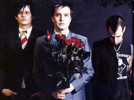
I picked this cover because of the cover starts. Blink 182. They are my favourite band and it’s hard to find a decent cover of them but I think this one summed them up pretty well. In 2005 they had a messy brake up and now they are back. Just having those 3 on the cover is an amazing feat at this point but the way they are stood makes them look reunited, brothers almost. The fact they are covering the main title shows that Kerrang! Is such a renowned magazine it does not even need to show the whole cover? The cover photo may not have even been taken in that pose but to create a feel of unity and trying to make the band look close after their brake up they have been photoshopped together. The cover is very messy and this replicates the type of music that is being displayed in Kerrang! It also as a basic 3 colour scheme. Yellow, blue and red. The Mast head is usally big,hard hitting and gritty but in this case is hidden by the band. For this genre of magazine mast heads are usally red,black or white and this is no excption,Kerrang usally mix it up this time it is black and white but they have been known to use red aswell. You notice the things that are in black,white or red are the most important things on the whole cover whereas the yellow and blue things are small pedantic stories. The word Kerrang! sounds like a guitar being strum though a huge amp and therefore relates to the genre of music that is portrayed in the magazine.

This cover also has Blink 182 on it but it is for an American magazine called Alternative Press. It is similar to what we have in the UK like Kerrang! NME and Rocksound. It has a similar layout to magazines like Kerrang. Quiet messy and unorganised just like the band that they publish

Skrillex is a electronic music producer and has pionerred the recent "Dubstep" revolution. The magazine is Rocksound and this has a slightly more oragnised feel compared to Kerrang! The clour scheme is blue,yellow and pink. Yet again the title is still partially covered my Skrillex's head so they ediotors obviouslt don't feel a need to push the magazine to become a renowned name.
Wednesday, 11 January 2012
Subscribe to:
Comments (Atom)